
Editorial: A Chic Celebration at The Kensington
There is a special kind of thrill in reimagining what a city wedding can feel like. Less about convention, more about contrast and intention. For this editorial at The Kensington, the creative team set out to let the architectural bones of the venue, the sculptural cake, the florals, and the stationery each speak for themselves. The result is a study in proportion, texture, and modern restraint.

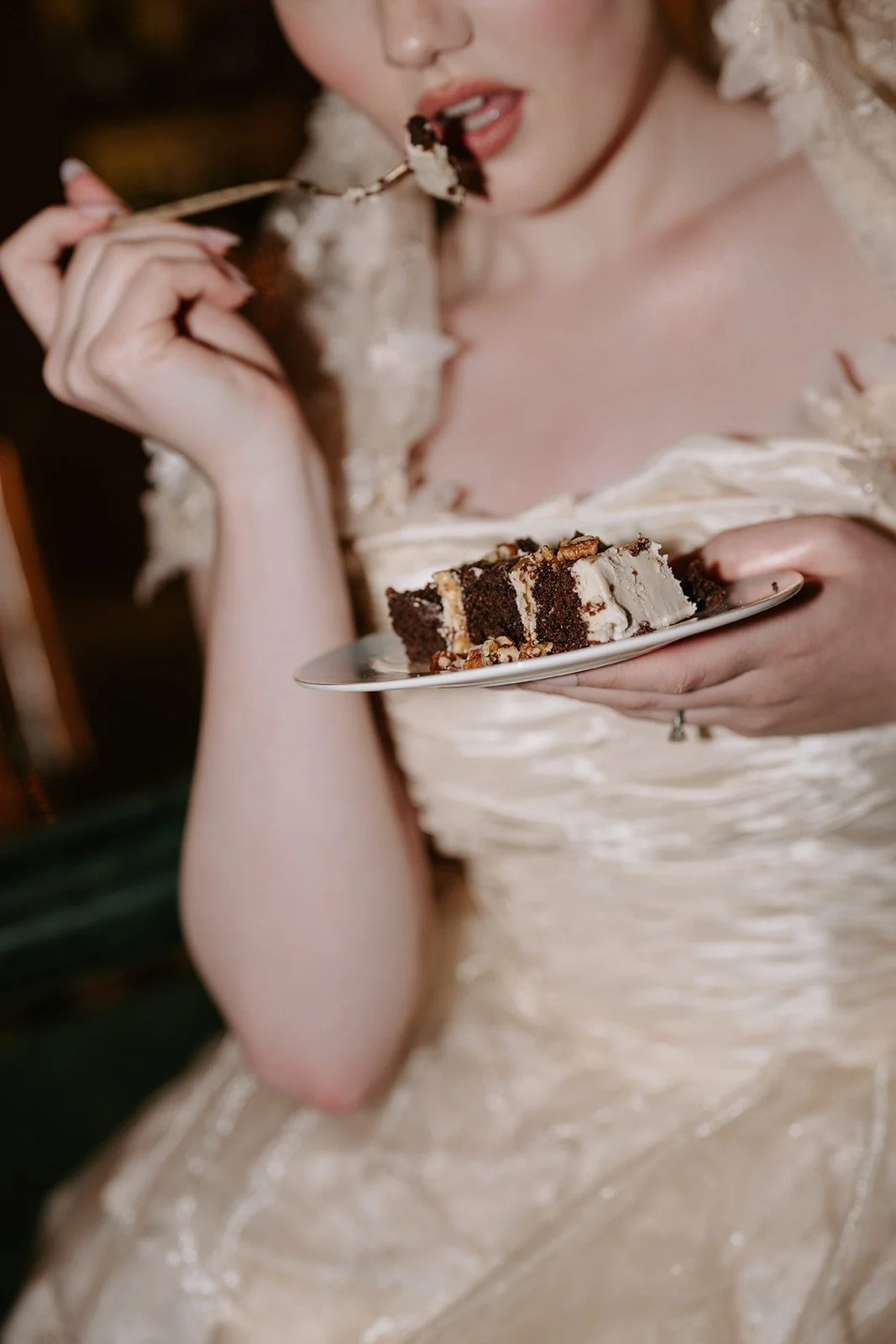
The Cake as Catalyst
Many weddings begin with florals; this one began with cake. Valeria Dolci Cakes created a statement design that became the creative anchor for the entire shoot. Its sculptural, wavy form, finished with surreal parrot tulip sugar petals, was both delicate and architectural.
Everything flowed from there. The colour palette, table styling, and stationery design all took cues from the cake’s movement and rhythm. It was a beautiful reminder that inspiration can come from unexpected places.


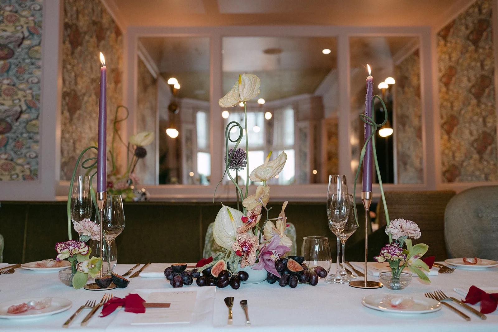
The Venue as Voice
The Kensington Hotel offered the perfect canvas. A Victorian townhouse reimagined with contemporary sophistication, it pairs marble fireplaces and deep-toned panelling with modern furnishings and artful lighting.
Each interconnecting room brings its own personality, yet together they tell a cohesive story. The transition from library to dining hall feels effortless, the kind of spatial choreography that gives guests permission to breathe and observe. This sense of flow shaped the entire creative direction.
If you love design-led, city-centre weddings that balance historic architecture with modern elegance, you can explore more London wedding inspiration across the Ink & Paper blog.


Florals as Conversation
Burton’s Blooms approached floristry with an artist’s sensitivity. Instead of grand installations, they created sculptural compositions that spoke to the space. The palette drew on the Kensington’s interiors - deep burgundies, muted greens, and soft neutral undertones - accentuated with orchids that echoed the verticality of the rooms.
Each arrangement felt like a dialogue with its surroundings; not decoration, but punctuation.


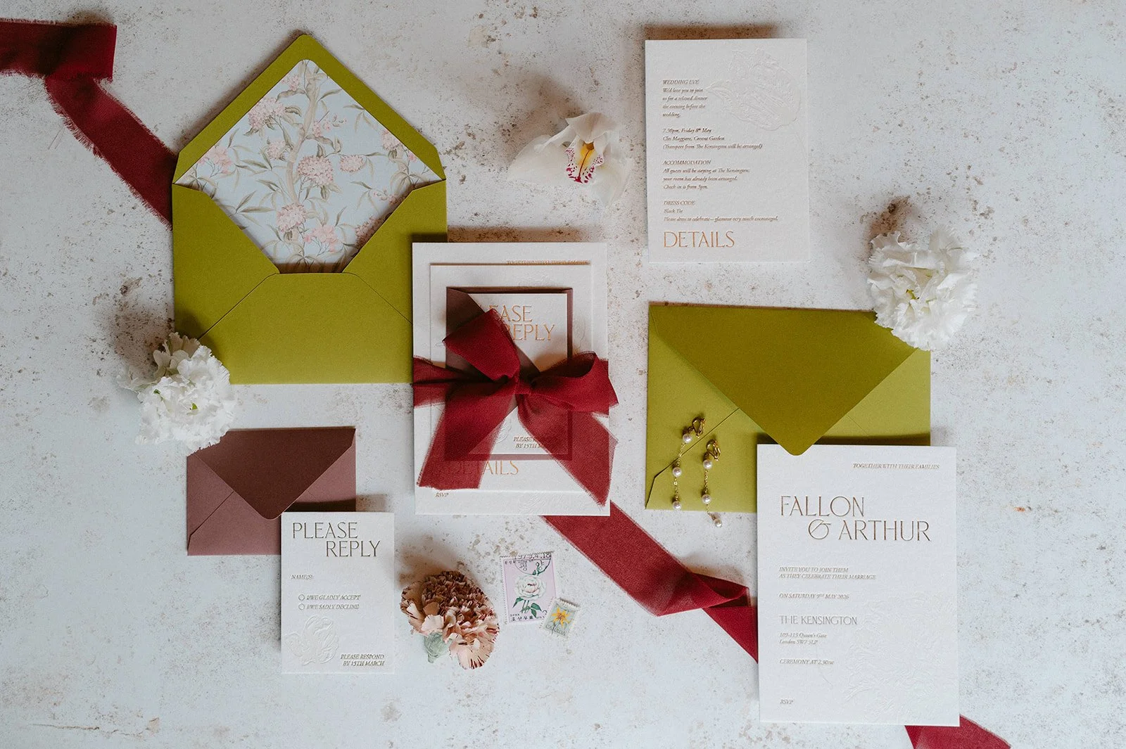
The Quiet Power of Print
For Ink & Paper’s stationery and signage, the guiding principle was refinement through restraint. Thick, tactile card stocks, minimalist typography, and sculptural shapes mirrored the same visual rhythm as the cake. The paper suite featured subtle foiled accents and curved forms that softened the composition without losing its structure.
Menus, place cards, and signage shared a visual language of considered simplicity. Each element added quiet confidence to the space, grounding the editorial in texture and craftsmanship.
If you are drawn to this aesthetic and are planning your own city wedding, you can begin your stationery journey here.


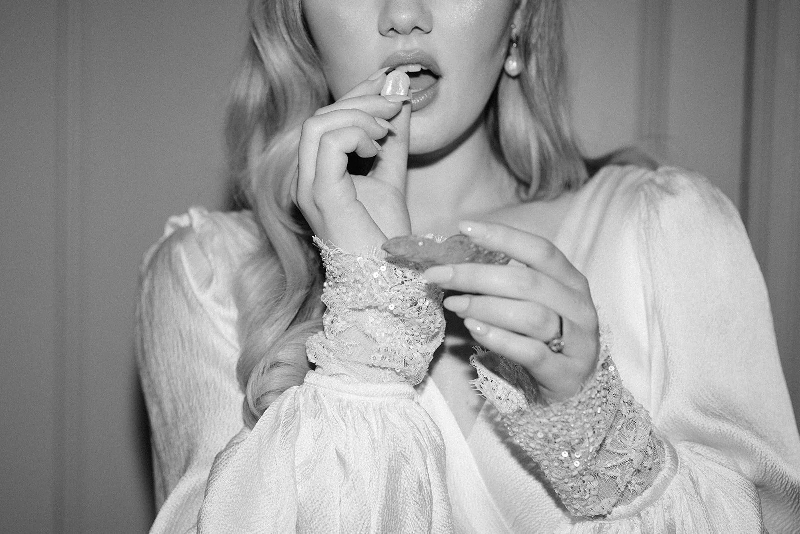
Style, Presence and Poetry
The gowns from Julita London embodied movement and air; timeless yet modern. Bex Hair & Makeup crafted a soft, sculpted beauty look that felt effortless but intentional. Jewellery by Debbie Carlisle added light-catching punctuation.
Photographer Lynn Shapiro approached the shoot with a fashion editorial sensibility, capturing the negative space as thoughtfully as the detail. Every frame carried a sense of presence without excess.


This London editorial is an ode to restraint. Each element was expressive, yet nothing overpowered the rest. The venue offered its voice, the cake its movement, the florals their dialogue, and the stationery its quiet authority. Together, they created a celebration that felt deliberate, modern, and deeply elegant.
If your vision for your wedding is rooted in intention and design, I would love to help you bring it to life through bespoke wedding stationery that feels as timeless and intentional as your setting.
Credits
Concept, Co-Planner and Cake Design Valeria Dolci Cakes | Photography Lynn Shapiro Photography | Florals Burton’s Blooms | Dresses Julita London | Venue The Kensington | Veils & Accessories Rebecca Anne Designs | Stationery & Signage Ink & Paper | Jewellery Debbie Carlisle | Hair & Makeup Bex Hair & Makeup